https://www.myfonts.com/fonts/vozzy/quick-or-dead/
A vintage look layered label font named “Quick or Dead”. This font was inspired by American wild west history. The family includes six styles (including effect styles), for sample look at preview. This font will good viewed on any retro design like poster, t-shirt, label, logo etc.

Orelo Typefaces Collection
Orelo is more than a typeface, it’s a big font-family turned into a variable-font. It comes with 120 styles ranging from Condensed Hairline to Wide Heavy, Italics, and a special Text version. That why I like to call it a ‘Collection’. Orelo Typefaces allows demanding users to work with more than just those predefined styles of a common retail font family. You can enjoy an array of almost endless amount of weights and widths, smoothly blending from Hair to Heavy. Select and use any intermediate style, either one at a time, or all mixed simultaneously. This freedom offers new creative possibilities, no matter if you're designing for print or web.


https://www.myfonts.com/fonts/vozzy/bandidas/
Introducing a vintage look label font named “Bandidas”.Typeface includes five styles plus aged version, for sample look at 4th preview. This font will good viewed on any retro design like poster, t-shirt, label, logo etc.

Taters Font Family
Taters is the product of my time at Type@Cooper West, starting out as a late night experiment in my kitchen with a potato and a carving tool. I made stamps and prints, then devised a set of rules that became this weird and wild typeface. Taters brings bold and fun flavor to whatever it's paired with, perfect for your next music festival branding project or neighborhood bake sale flyer.


https://www.myfonts.com/fonts/vetteletters/vlnl-berlagebrug/
Designer Donald DBXL Beekman daily crosses the Berlage bridge spanning the Amstel river in Amsterdam. The Berlagebrug was built as part of the city planning project ‘Plan Zuid’ by H.P.Berlage and opened in May 1932. Its name, carved out of two granite headstones, sparked the design of this font family. The original lettering is attributed to Anton Kurvers in the early 19th century, and can be seen on many Amsterdam buildings and bridges. It’s typical lettering of the Amsterdamse School, the Dutch equivalent of the expressionist art deco architectural style, and mostly known for its extravagant brick work.
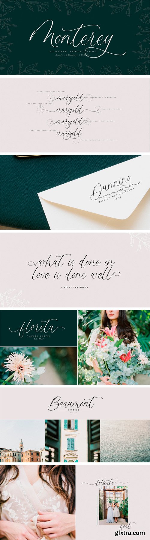
https://www.myfonts.com/fonts/luna-paper-co/monterey-script/
Monterey Script was built with OpenType features and includes beginning and ending swashes, numbers, punctuation, alternates, ligatures and it also supports other languages. It is perfect for adding an elegant touch to all of your branding and wedding needs!

Interstate Font Family
Based on the signage alphabet used by the US Federal Highway Administration, Tobias Frere-Jones created his Interstate in 1993 and 1994. It is extensively used on road signs, other official information boards and, of course, on the signage used on the US interstate highways – hence its name. With its total of 44 styles, it is particularly versatile and can be used in newspapers, magazines, books and for corporate design projects.
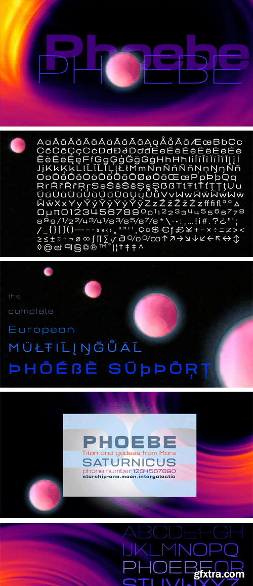
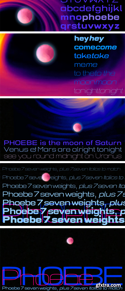
https://www.myfonts.com/fonts/wiescherdesign/phoebe/
Phoebe is an experimental font, roughly based on a kind of too wide square. But as it is with experiments, they tend to live an own life, uncontrollable. there are very few straight lines in this font and it looks familiar but then it doesn’t. Phoebe is a Titan as well as one of the outer moons of Saturn and Venus and Mars are alright tonight. Phoebe comes in 7 weights and all of them are quite useful once you start using them. Just look at the font and enjoy.
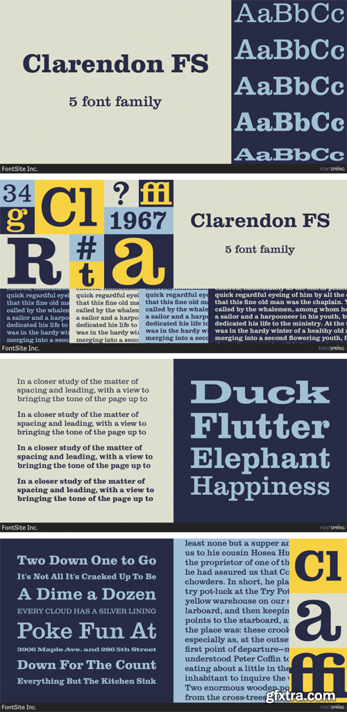
https://www.fontspring.com/fonts/fontsite/clarendon-fs
Clarendon FS is a slab serif font family. This typeface has five styles and was published by FontSite Inc.

https://www.myfonts.com/fonts/studio-k/anvil/
The days of hot metal may be behind us, but Anvil looks as if it has been forged in a smithy’s fire: a handsome, heavyweight display face that is both impressive and impactful.

Murder Face Font
Inspired by roman typography and extreme metal band logos. This is a vicious looking font that works great in large and small pt. sizes. Ideal for rock bands, alternative literature, films, video games and apparel.
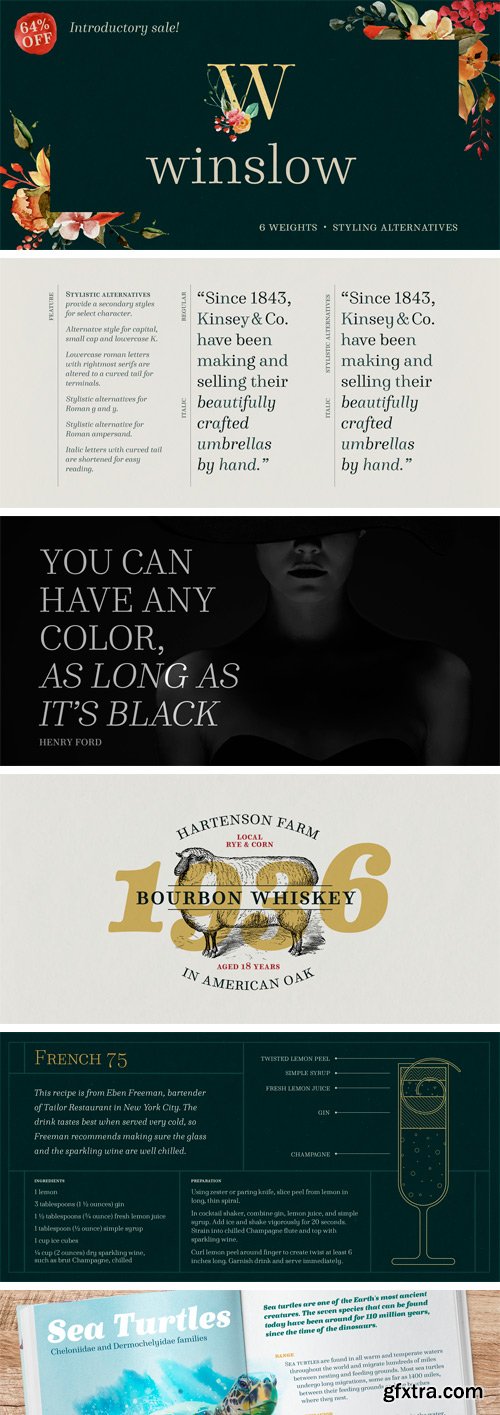
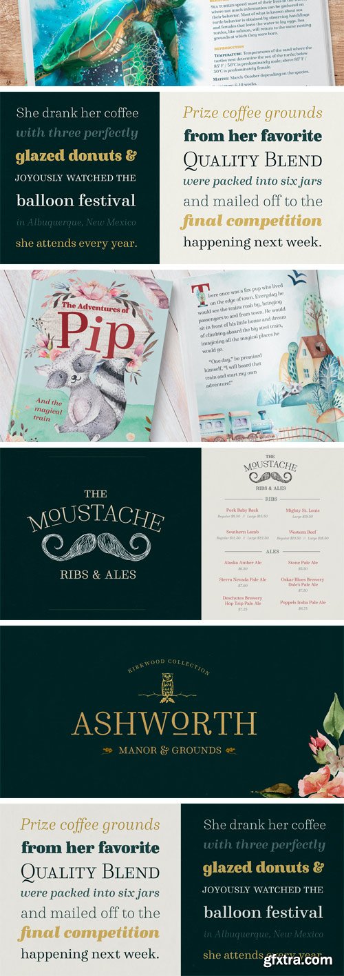
https://www.myfonts.com/fonts/kimmy/winslow-book/
Winslow Book is a playfully modern typeface with 6 weights and packed with styling features. Delicate features give it a playful feel while keeping Scotch Modern attributes of vertical stress, bracket serifs and ball terminals, while unique features give it a personality of its own. Winslow was designed to be a perfect typeface for text and display purposes.


Romantica Script Font
The Romantica is a modern script font. It has a feminine and elegant feel and is perfect for titles, posters, quotes, and much more!

https://www.myfonts.com/fonts/sudtipos/sincopa/
Síncopa is named after syncopation, the unexpected, uneven, or offbeat rhythms in music. Syncopation transforms a regular metronomic beat into something that stirs us to feel, move, or dance. The Síncopa typeface family explores these forces of stability and dynamism, of the beat and the offbeat. Inspired by three queens of jazz – Billie, Nina, and Ella – Síncopa seeks to emulate their bold voices and distinctive personalities with highly contrasting strokes and eclectic letterforms.


https://www.myfonts.com/fonts/mrletters/heavenly/
Heavenly Script is a modern calligraphic font with a very cool handwriting style, this font is perfect for your various design needs such as branding, wedding invitations, magazines, mugs, business cards, posters, and more. Heavenly Script is equipped with glyphs and alternative characters, allowing you to have many different character choices when starting your design.


https://www.myfonts.com/fonts/niramekko/vinila/
Grotesques can answer a really wide variety of design problems and go from small sizes to large without missing a beat. Vinila is Flora de Carvalho’s take on the genre. The family’s multi-purpose intention comes from having 4 widths - from compressed to extended, each with 6 weights and obliques.


GoliaGolia Display Font
Goliagolia is a geometrically imperfect wavy font that's something in-between hand lettering and the Möbius band. Each letter has been designed to have distinct details that differ from the rest of the letters while still being able to fit in the whole style of the font. This creates a less rigid type in which the imperfect hand lines meet with modern sharp curves to give the typeface an unique contrast.

Retroverso Font
The Rectoverso is a sans serif font that is designed by considering aspects of readability, legibility and clarity. So it’s very suitable for headlines, or other design projects that require a stand-out display font that looks simple, minimalist, and bold.
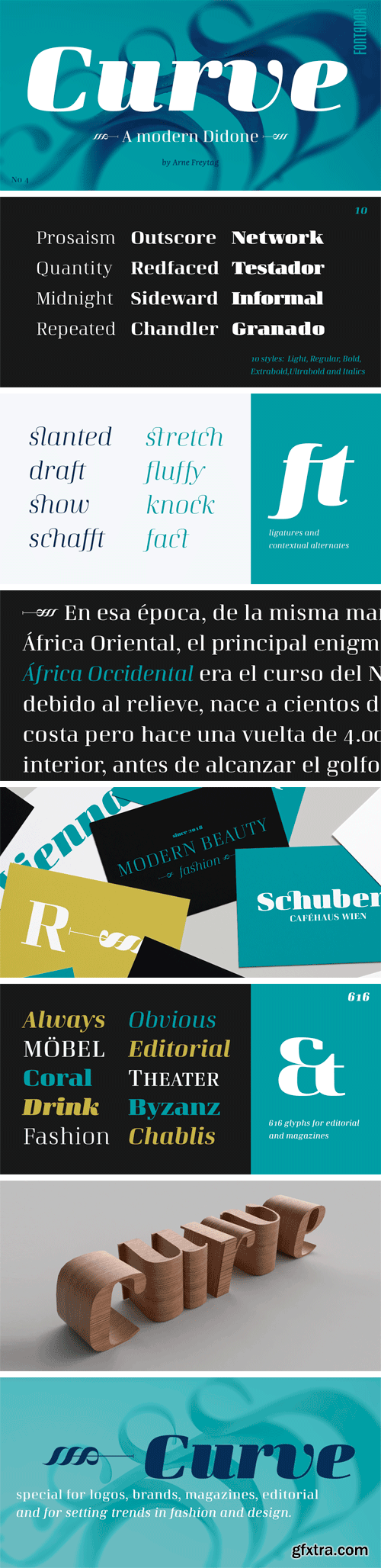
https://www.myfonts.com/fonts/arne-freytag/curve/
Curve is a modern neo-classical typeface family with some features of the Didone genre, but especially designed for contemporary typography. A large x-height not only creates space in the letters for extra-bold styles, but also lends Curve an open and generous character in the more narrow and semi-bold versions. It has 616 glyphs with small caps, numbers and ligatures in 10 weights. Curve is a contemporary serif typeface, special for logos, brands, magazines and editorial and for setting trends in fashion and design.
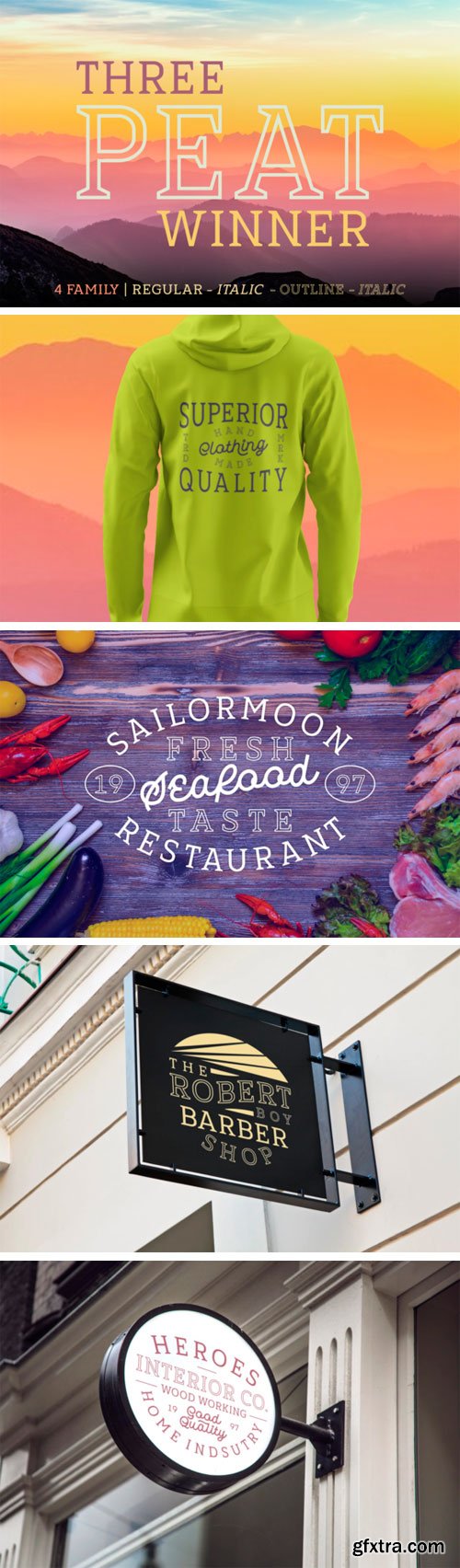
Three Peat Winner Font Family
The Three Peat Winner is a fun script family. It includes 4 variations which can be combined perfectly. Give an unique and striking touch to your designs with this amazing font!
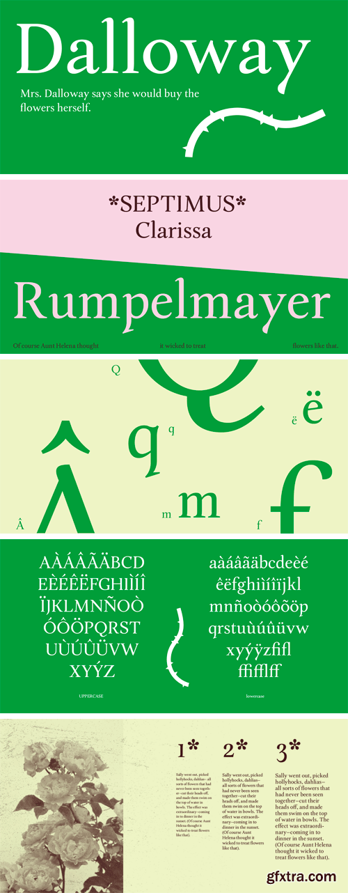
https://www.myfonts.com/fonts/shuang/dalloway/
Inspiration of the typeface Dalloway comes from Virginia Woolf’s novel “Mrs. Dalloway”. Some calligraphic features are incorporated to add humanity to this typeface. Because Woolf’s writing style is very sentimental and personal, which somehow reminds me of the feeling of reading someone’s dairy. Some other features of this typeface takes inspiration from flowers and plants, which is another influence from the book. Flower appears in the first sentence of the novel and works as an important symbol throughout the whole story.
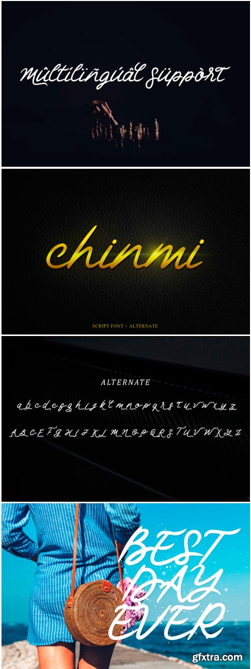
Chinmi Script Font
Chinmi is a Japanese term meaning literally “rare taste”, but more appropriately “delicacy”. This script font has unique uppercase’s, beautiful and elegant lowercase’s, and is suitable for name cards, posters, invitations, social media posts, and much more!
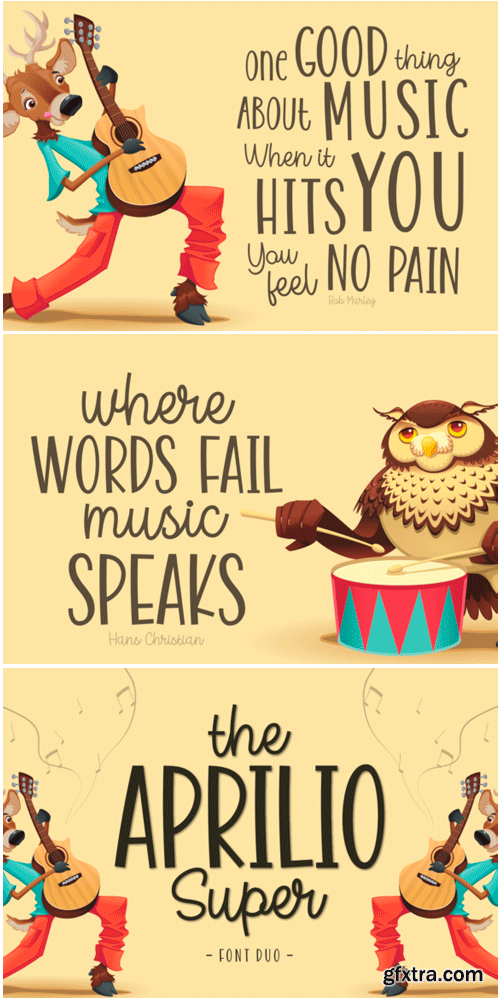
The Aprilio Super Duo
The Aprilio Super is an amazing font duo. It includes 2 playful styles which can combined perfectly, giving you the opportunity to create multiple unique designs in an instant.
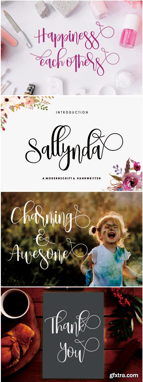
Sallynda Script Font
The Sallynda is a modern script font. It was created with a brush and ink, and includes an irregular baseline. It’s perfect for use in watercolor designs, blog headers, branding, t-shirts, weddings, social media, product designs, stationery, advertising, apparel, covers, books, business cards, greeting cards, branding, merchandise, invitations and handmade quotes, and more.
SermonBox - Seasonal Collection
SermonBox - The Series Pack Collection
Top Rated News


Would you like to be a Author?