Behrens-Schrift Font
Behrens-Schrift is a unique font inspired by a renowned art nouveau type from 1902 with ornaments. It will turn any design project into a unique stand out!
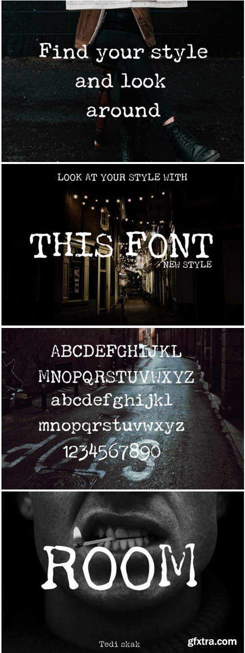
Room Font
Room is a fun and bold typeface with a unique twist. It will turn any design project into a stand out!

Gook Kitt Font
Gook Kitt is a fun and bold handwritten font with a lot of authenticity! It will add a unique spark to any design project.
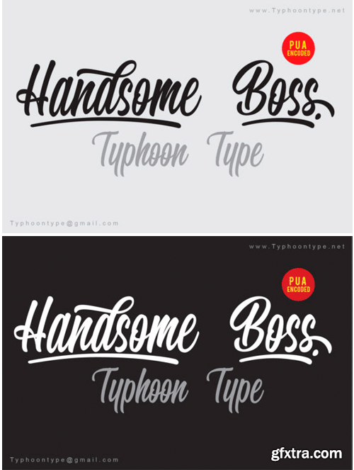
Handsome Boss Font
Handsome Boss is a fun and bold handwritten font with a lot of authentic charm. Get inspired by its bold swashes!
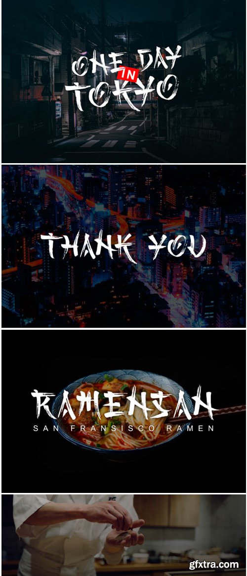
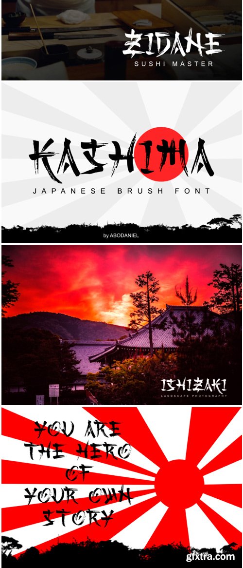
Kashima Font
Kashima is a unique display font with a bold feel. It will turn any design idea into a true stand out!
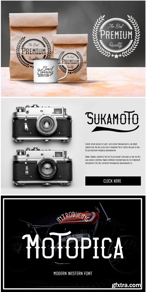
Motopica Font
Motopica is a fun vintage font with a modern twist. It will turn any design idea into a true stand out!
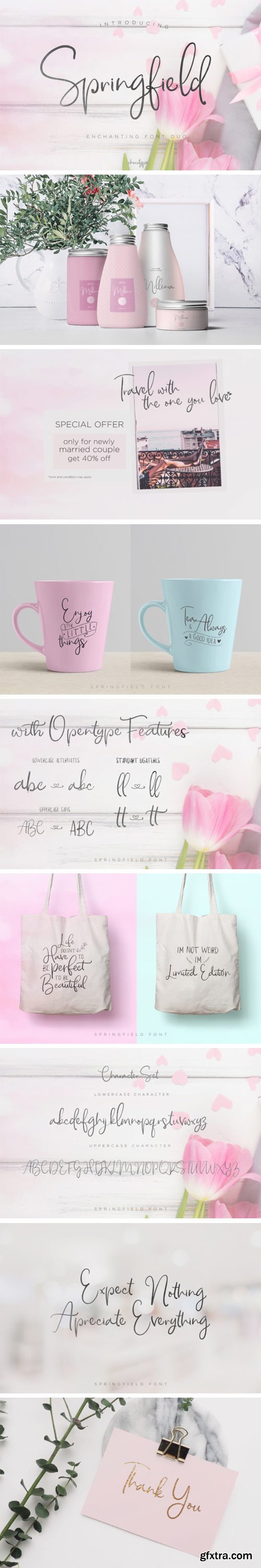
Springfield Font
Springfield is a handmade typeface with a cute character. Springfield Script has a large variety of alternate characters, allowing you to make each word completely unique.


https://www.myfonts.com/fonts/nicky-laatz/tanglewoods
A romantic little modern calligraphy font duo that will all whisk you off your feet! It comes with an extra dingbat font with oodles of sweet little flourishes and embellishments too! Tanglewoods Script has a lovely whimsical character with the natural organic flow from a real calligraphy pen. It’s perfect for weddings, feminine logos, branding, invitations, quotes, social media, websites, and well....just about anything pretty! :)
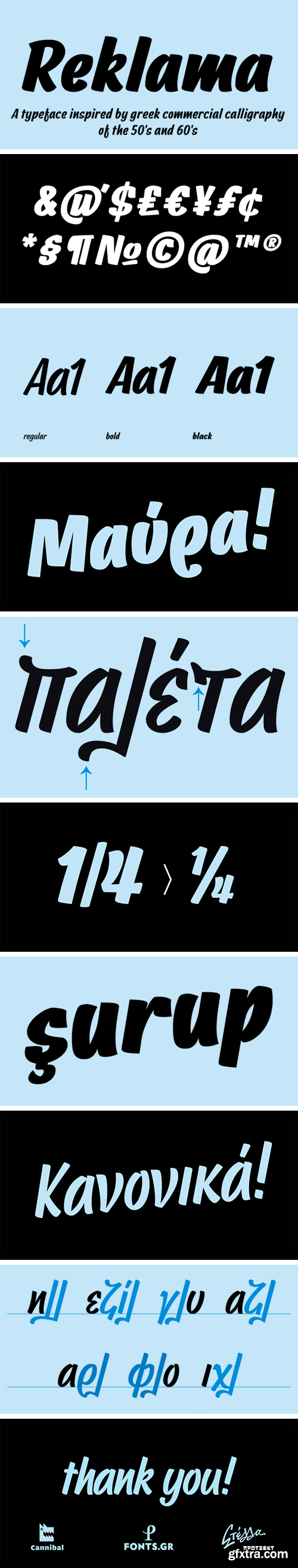
CF REKLAMA Font Family
CF REKLAMA, the second released typeface of the “Stella” project, is an attempt to translate the wiry stroke of the flat marker to typographic letters, while preserving the expressiveness of the script. The type was designed to work even in small sizes, but it’s idiosyncratic forms and some subtle details –such as the tear-like endings– become more interesting at large sizes.
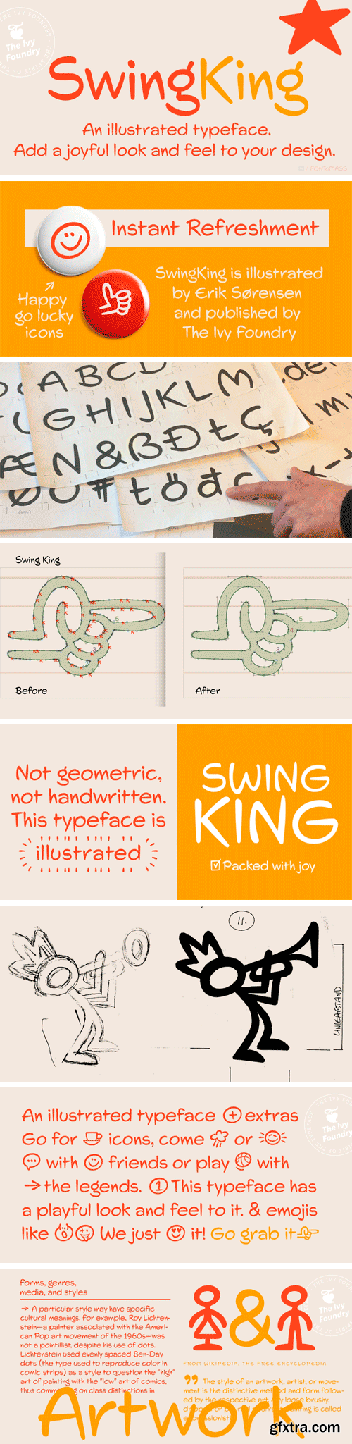
SwingKing Typeface
The typeface SwingKing is the work of the Danish illustrator Erik Sørensen. Through his long career in the pre-digital era he has made lots of air-brush illustrations, paintings and comic strips. He told me that he always had problems finding a typeface that felt right to him. So we talked about producing a useful typeface which wasn’t cartoonish, or handwritten, but more just like an illustrated font with all the charm and warmth of his always characteristic stroke drawings. My part of the work has been to digitalize it, polish it, making small improvements and asking for more icons.
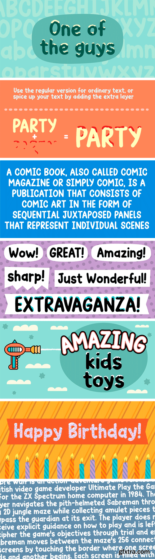
https://www.myfonts.com/fonts/pizzadude/one-of-the-guys
One of the guys is a simple, highly legible, mono lined comic book font. Simple, yes, but full of personality! Use it as it is, or spice up your text by using the extra layer. The extra layer could be ghouly slime, birthday cake cream, snow or whatever your imagination figures out!
https://www.myfonts.com/fonts/parkinson/azuza/
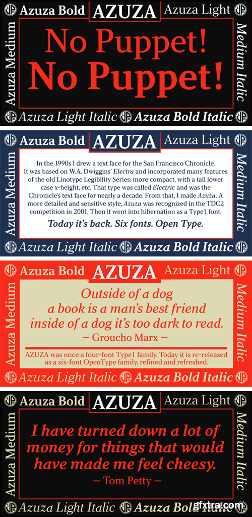
In the 1990s I drew a text face for the San Francisco Chronicle. It was based on W. A. Dwiggins’ Electra and incorporated many features of the Linotype Legibility Series: More compact, with a taller lowercase X-height, etc. That type was called Electric and it was the Chronicle’s text face for nearly a decade, surviving several redesigns. From that, I made Azuza, a more detailed and sensitive style. Azuza was recognized in the TDC2 type competition in 2001. Then it went into hibernation as a Type 1 font family. Today it is back. Six fonts. Open Type.
Raisonne Pro Font Family
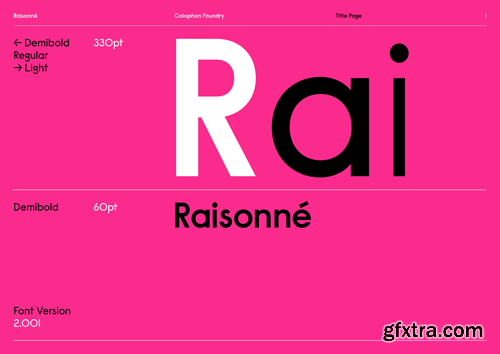
Raisonné is a geometric sans-serif type initially designed in and around the summer of 2010 and subsequently expanded upon, first in 2012 and again in 2018. After several years of internal and external customisations, assorted expansion inquiries, and miscellaneous bouts of sketching, its original single weight—Demibold—is now complemented by Light and Regular weights in tandem with corresponding obliques and an expanded character set.
https://www.myfonts.com/fonts/pepper-type/mazzard/
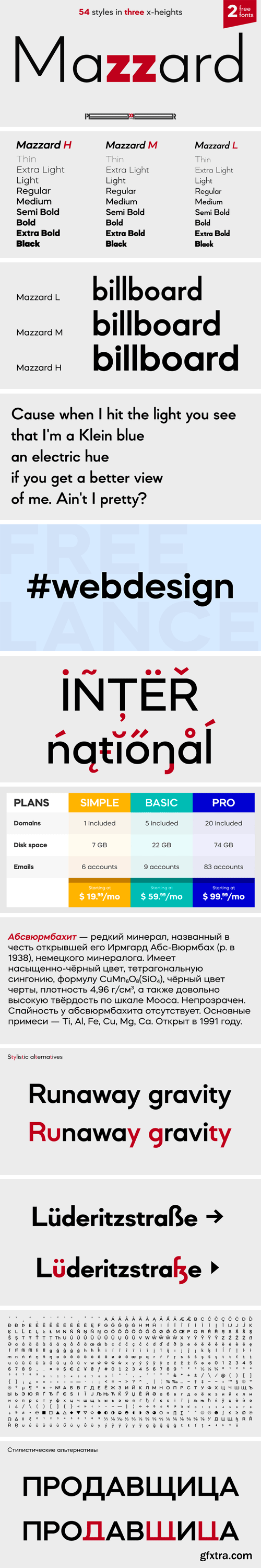
Mazzard is a superfamily of three geometric grotesques with three different x-heights (H, M, and L). It features rich language support including Cyrillic, and offers a wide variety of alternate forms to choose from.
LFT Etica Mono Font Family
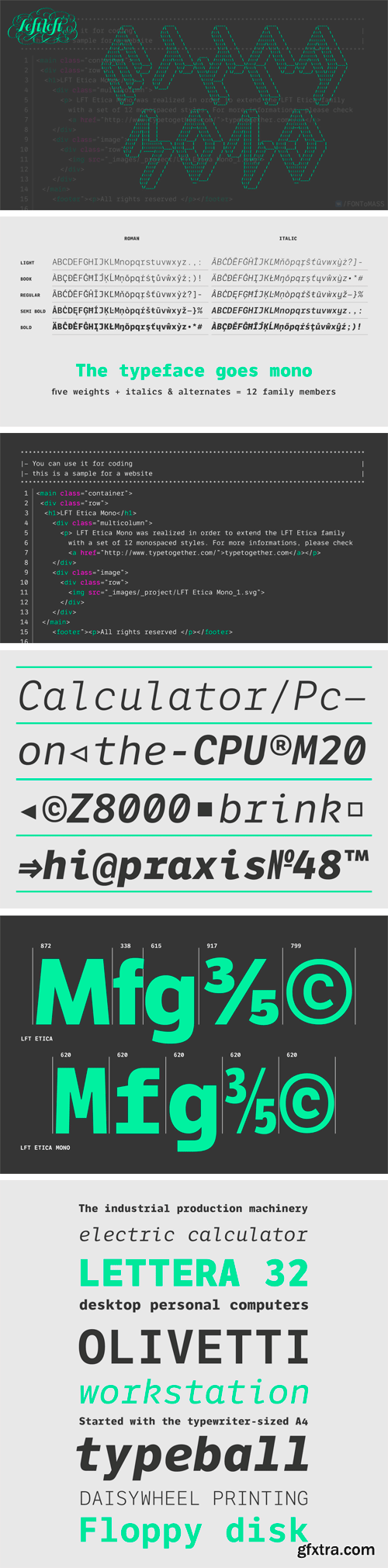
If code is the present and the future, it’s best to get used to it now. LFT Etica Mono makes that a pleasure with its ability to be used as a true coding font or graphic design element.
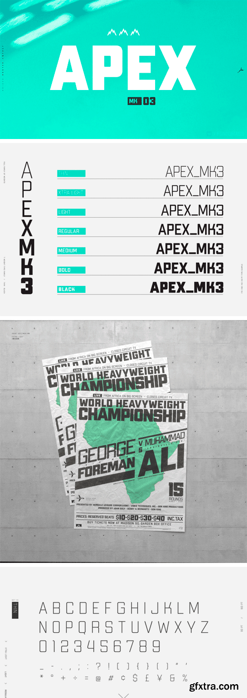
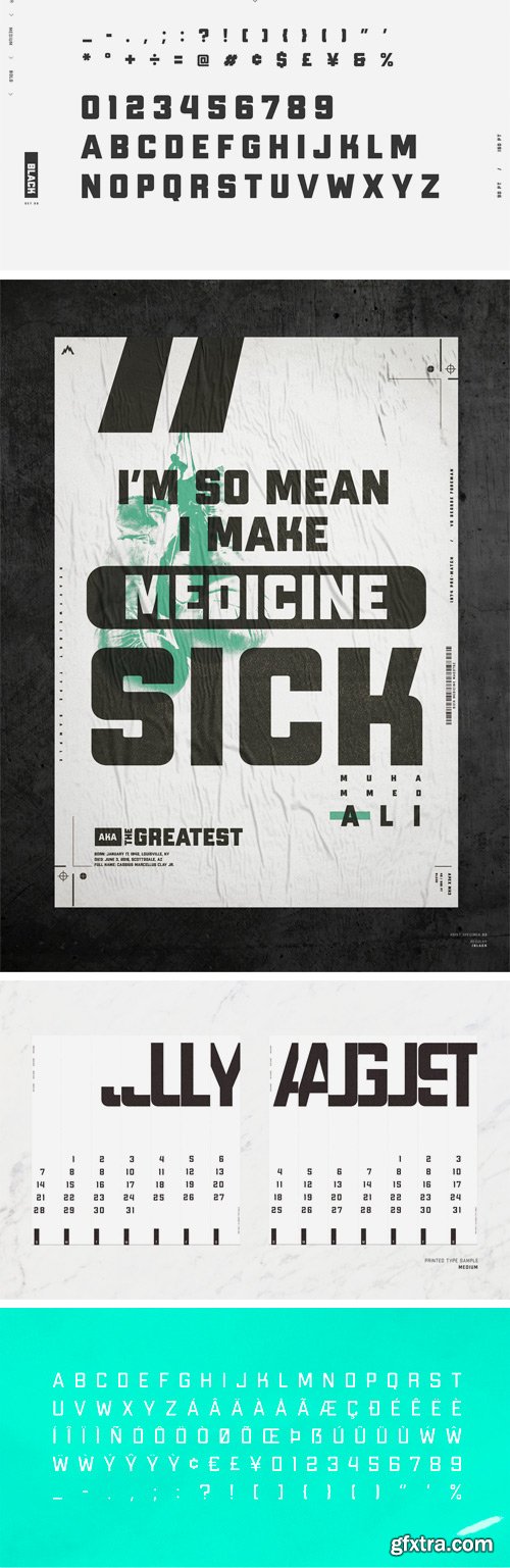
APEX Mk 3 - Geometric Display Type Family
A robust display typeface, Apex Mark 3 takes inspiration from classic geometric forms, sans serifs, and workhorse athletic block type. Simplicity of form gives it flexibility for a broad range of uses, while its geometric frame provides the foundation for its decisive tone. Including seven weights, the family ranges from Thin (100) to Black (900).
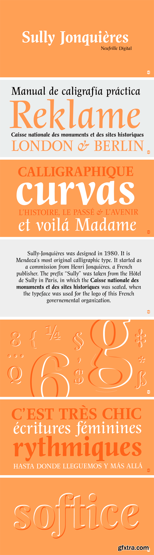
https://www.myfonts.com/fonts/neufville/sully-jonquieres-nd/
Sully-Jonquières (1980) is Mendoza's most original calligraphic type design. It started as a commission from Henri Jonquières, a French publisher; the prefix 'Sully' was taken from the Hôtel de Sully in Paris, in which the Caisse nationale des monuments et des sites historiques was seated, when the typeface was used for the logo for this French governemental organization.


https://www.myfonts.com/fonts/vetteletters/vlnl-bleek/
Bleek started its life as a logo for a rock band with the same name. This makes sense as it has distinct roots in classic rock logo design. Any rock band name set in VLNL Bleek looks instantly cool – profi logo quality! Of coarse Bleek will serve an awesome purpose as a headline font as well. Or gig flyers and posters. Or band backdrops. Just turn it up to 11!

https://www.myfonts.com/fonts/paratype/mirandolina/
A freestyle serif typeface, some details of its letterforms are modelled after flat-nib pen calligraphy (serifs with slanting ends, cutting terminals). Three decorative calligraphic versions with swashes and connecting elements are incuded. For text and display typography. The face designed by Natalya Vasilyeva and licensed by ParaType in 2007.
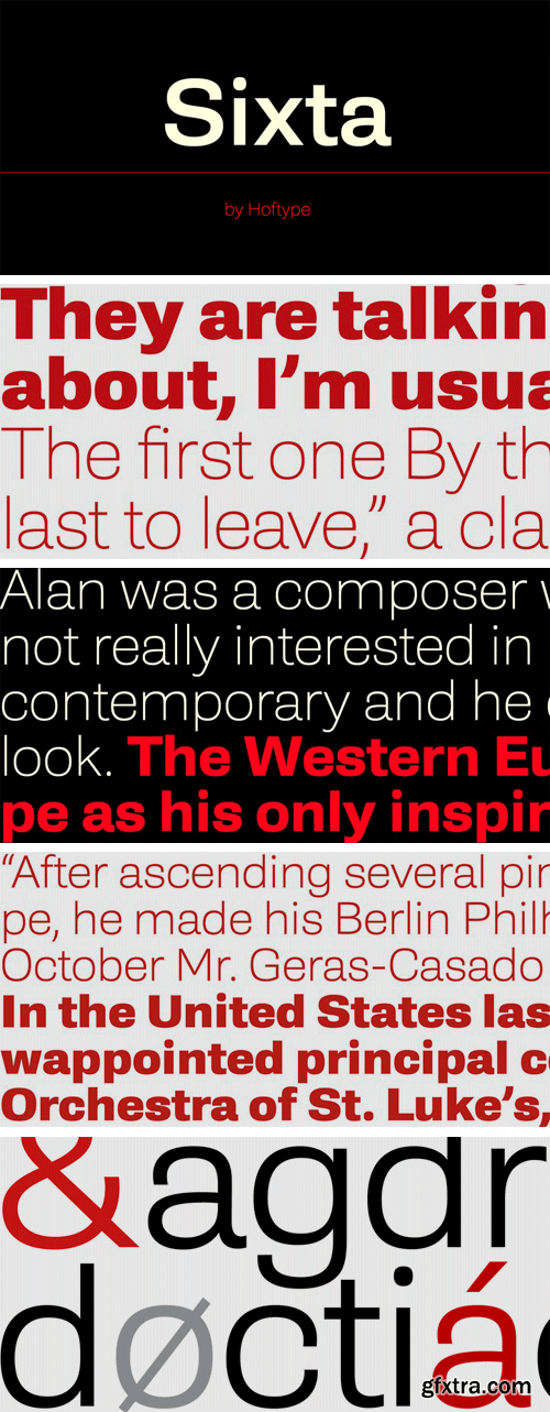
https://www.myfonts.com/fonts/hoftype/sixta/
Sixta, a new monoline face with a classical background, has comfortable proportions and a puissant appearance. Although it has plenty of movement and is eventful, its discreet stroke ductus makes it excellent both for text and display.
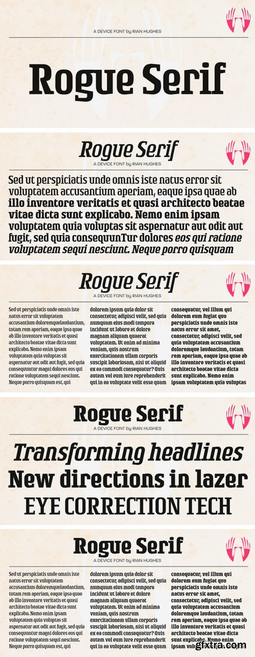
https://www.myfonts.com/fonts/device/rogue-serif/
Recently the Rogue family was designed as an accompaniment to Paralucent for Loaded, London's notorious lads-mag that had found its design being cloned by the competition and sought something unique to set it apart.
SermonBox - Seasonal Collection
SermonBox - The Series Pack Collection
Top Rated News


Would you like to be a Author?