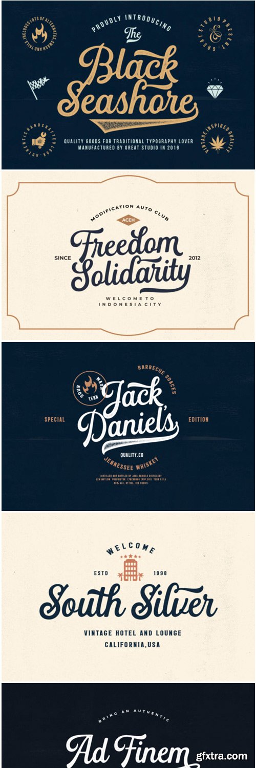
Black Seashore Font
Black Seashore is a stunning and unique handwritten font, full of flavor. It will add a vintage feel to any design project.
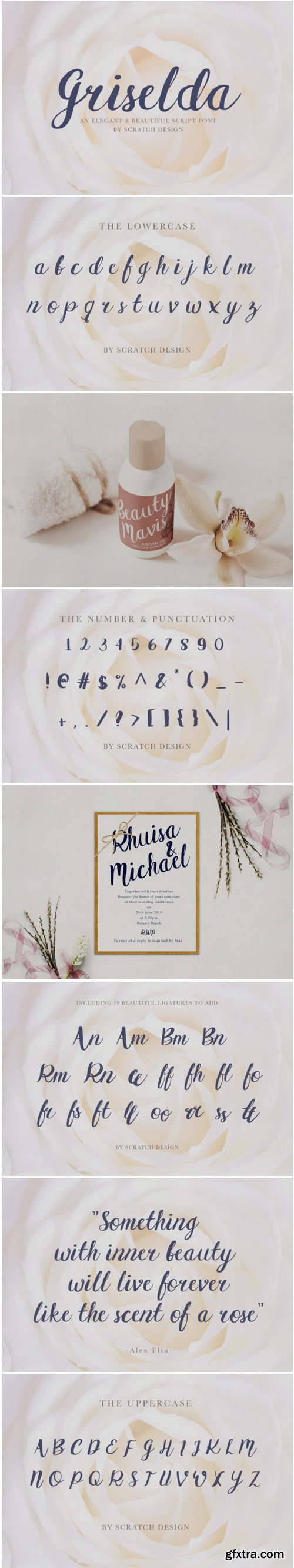
Griselda Font
Griselda is a stunning handwritten font full of authenticity! Get inspired by its unique charm.
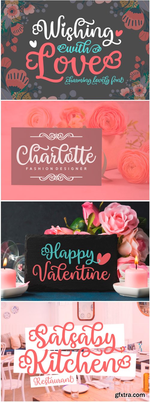
Wishing with Love Font
Wishing with Love is a beautiful and inspiring script, full of charm. Fall in love with its striking elegance.
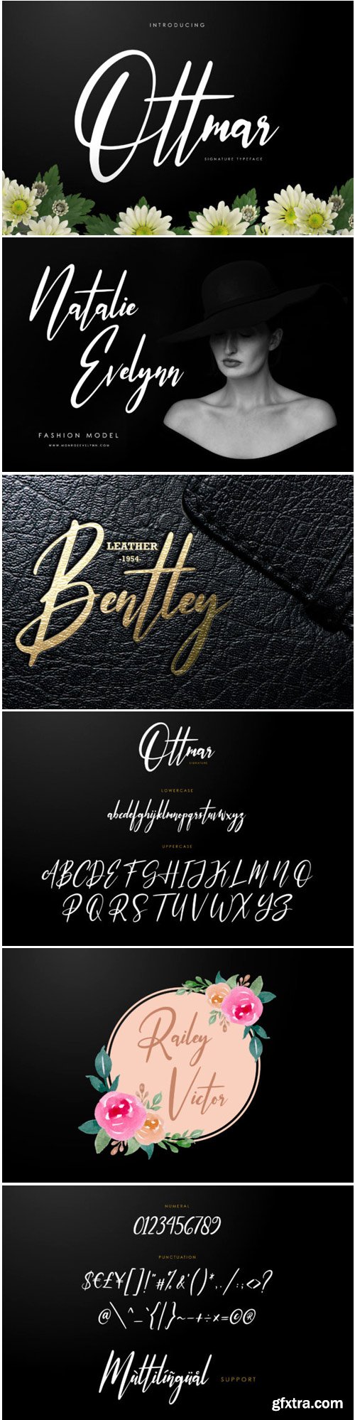
Ottmar Font
Ottmar is a light and casual handwritten font with a unique feel. It will effortlessly add an authentic twist to any design project.
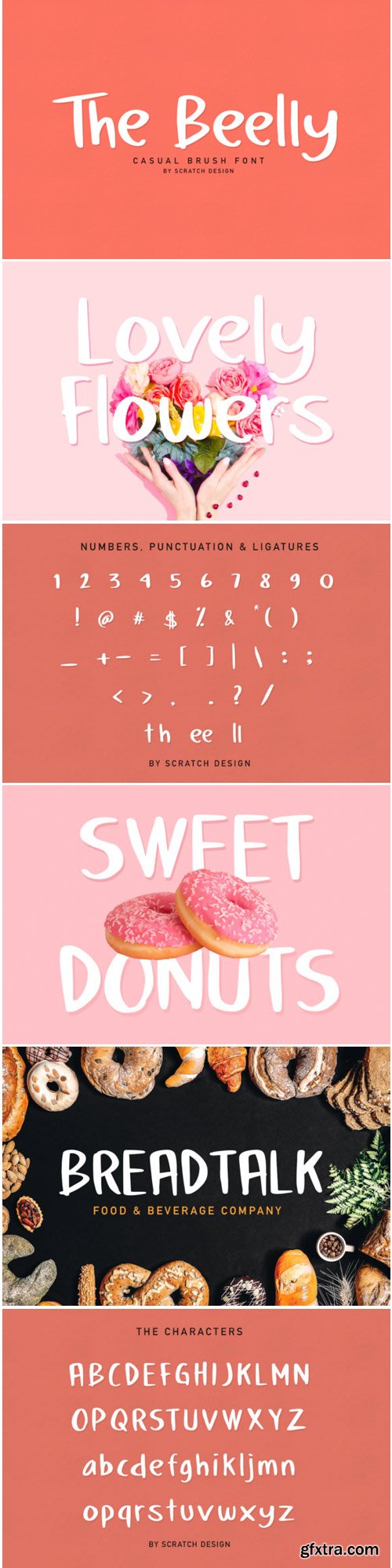
The Beelly Font
The Beely is a simple but classy handwritten font that is perfect for a big variety of design projects. Get inspired by its chunky feel.
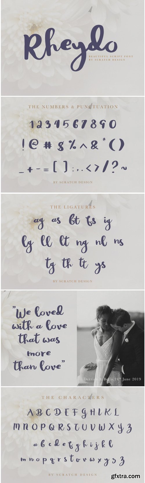
Rheydo Font
Rheydo is a natural and quirky handwritten font, full of energy. It will add a personal flavour to any design project.

ACCESS - Modern Typeface
ACCESS is a modern Sans Serif typeface inspired by some of world's best Sans Serif typefaces. ACCESS will be best suited for creating nicely looking text for any type of medium. The font comes with 5 weight (Including a Distorted version).
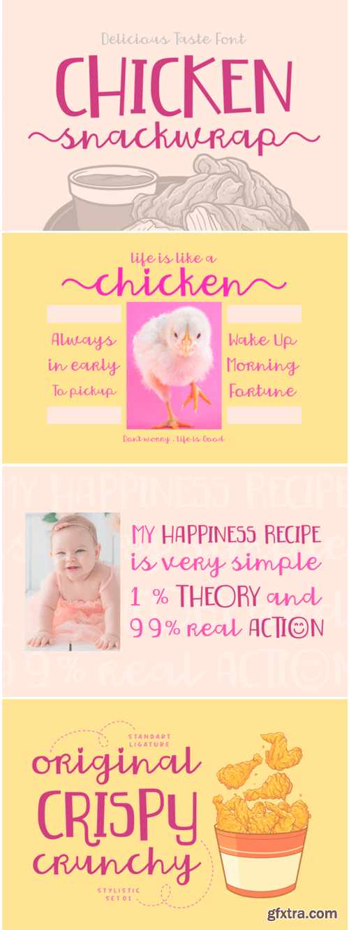
Chicken Snackwrap Font
Chicken Snackwrap is a fun and bold handwritten font. Full of personality, it will effortlessly turn any crafts project into a standout!
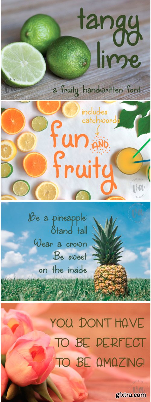
Tangy Lime Font
Feeling sour? Tangy Lime is a fun, handwritten font that’s great for a big variety of creative projects.
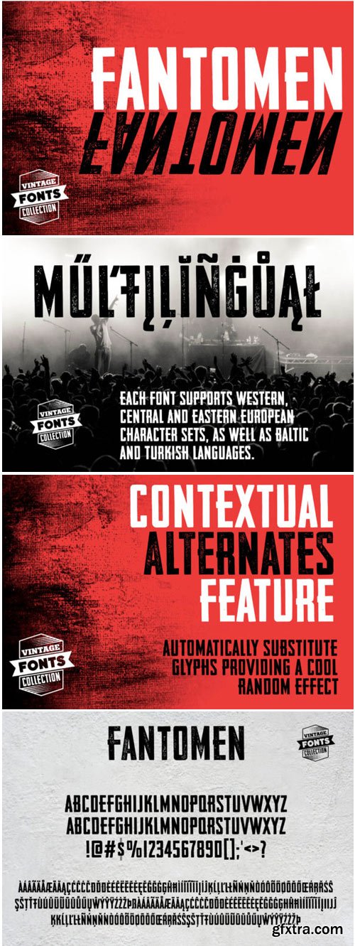
Fantomen Font
Fantomen is a set of 2 hand-drawn fonts inspired by vintage ads, old newspapers and retro sign painting. It will turn any design project into an eye catcher!
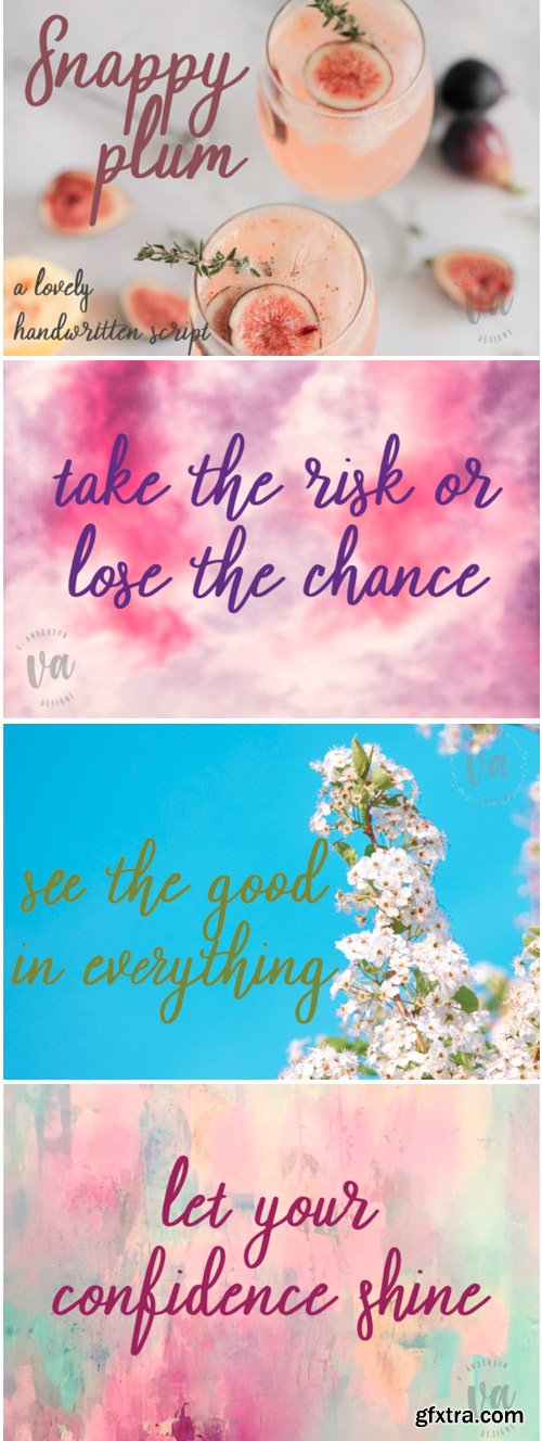
Snappy Plum Font
Snappy Plum is a romantic and lovely handwritten font, full of energy. It will add a bold feel to any design project.
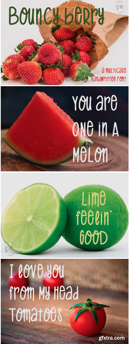
Bouncy Berry Font
Bouncy Berry is a fun, handwritten, multicase font that’s great for a huge variety of design projects.
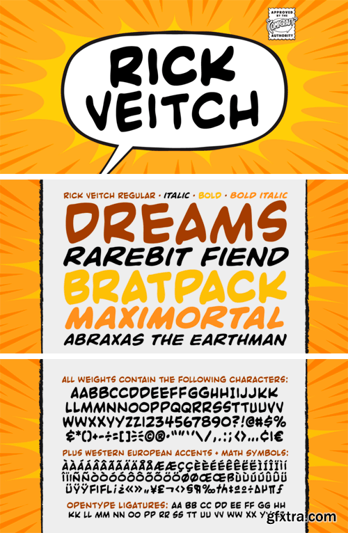
https://www.myfonts.com/fonts/comicraft/rick-veitch/
For our latest Master of Comic Book Art, Roarin' Rick Veitch, we've created a Brat Pack of fonts worthy of a Maximortal! This is The One! This will make your Heartburst! If you Can't Get No Rick Veitch between 1941 and 1963, wipe that Swamp Thing off America's Best Greyshirt, because this font is nothing short of A Miracle, Man! It's Epic!

Hand Drawn Fine Line Wild Flowers Set 1519422
Hand drawn black line clip art: individual floral elements, frames, watercolor background, and seamless pattern tile.
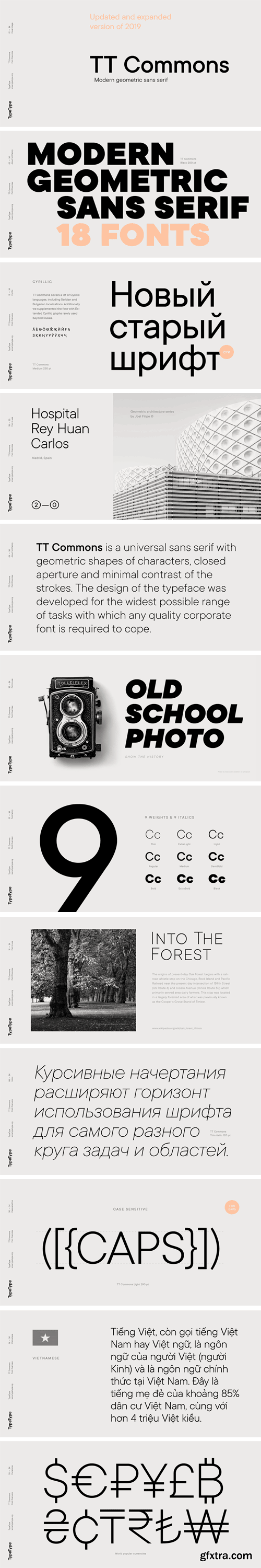
https://www.myfonts.com/fonts/type-type/tt-commons/
What's new:
• The number of glyphs has been increased from 771 to 1230
• Number of OpenType features increased from 19 to 27
• Added math and additional currency symbols
• Entirely new hinting has been done
• Added Vietnamese language
• Cyrillic support extended
• Latin support expanded
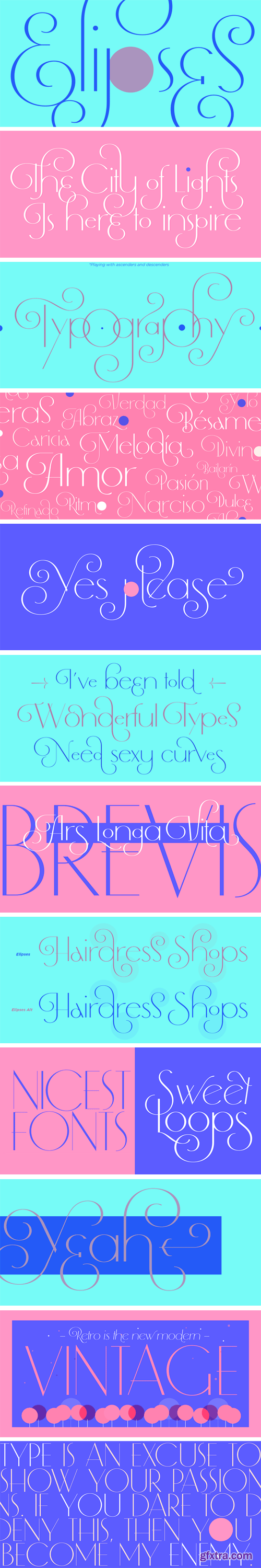
https://www.myfonts.com/fonts/argentina-lian-types/elipses/
It all began with an ellipse. Like an artist who goes from a pictorical logic to a more abstract one, in Elipses geometry is stripped of any distractive or ornamental detail. The font is naked and it shows that it does not need complex shapes or decisions in order to be very attractive.
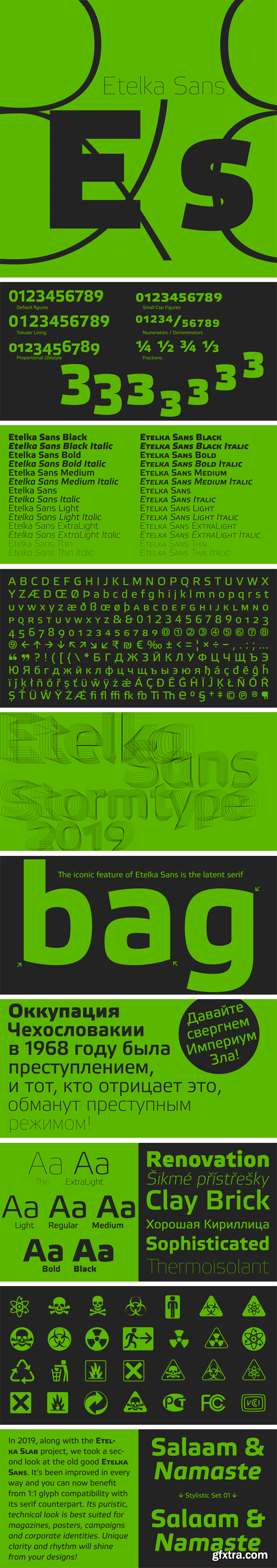
Etelka Sans Font Family (Updated 2019)
In 2019, along with the Etelka Slab project, we took a second look at the old good Etelka Sans. It's been improved in every way and you can now benefit from 1:1 glyph compatibility with its serif counterpart. Its puristic, technical look is best suited for magazines, posters, campaigns and corporate identities. Unique clarity and rhythm will shine from your designs!
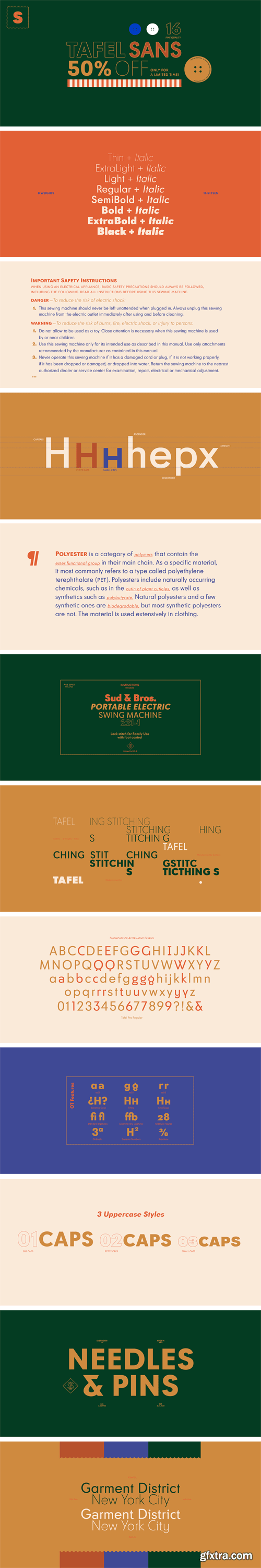
https://www.myfonts.com/fonts/sudtipos/tafel-sans/
Tafel is Sudtipos’ contemporary take on early- to mid-century geometric fonts; it has the intrinsic qualities of a geometric without following the strict rules they customarily employ. Tafel is notable for its versatility as it works well in both small and display sizes; its sophisticated elegance and refined simplicity make it ideal for corporate identities, street signage, fashion brands, luxury packaging and much more.
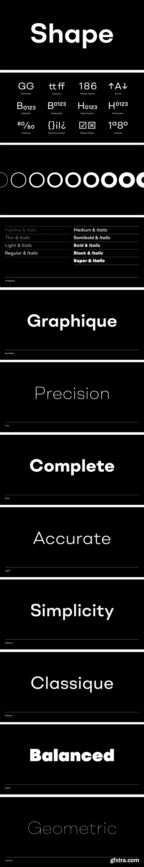
Shape Font Family
A contemporary geometric type family in 18 styles. Built with precision, simplicity and a subtle warmth. Flexibility is the founding principle around which Shape was designed. The family has been formed around an open and accessible aesthetic that puts content first. Shape is the perfect medium for conveying information with clarity and purity.
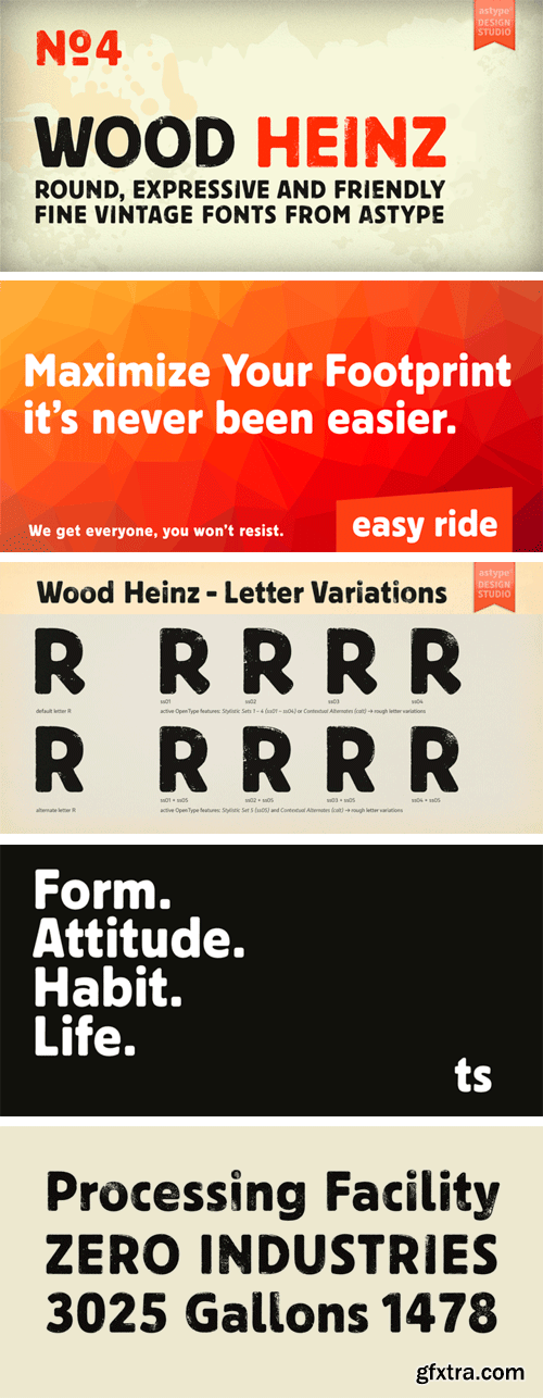
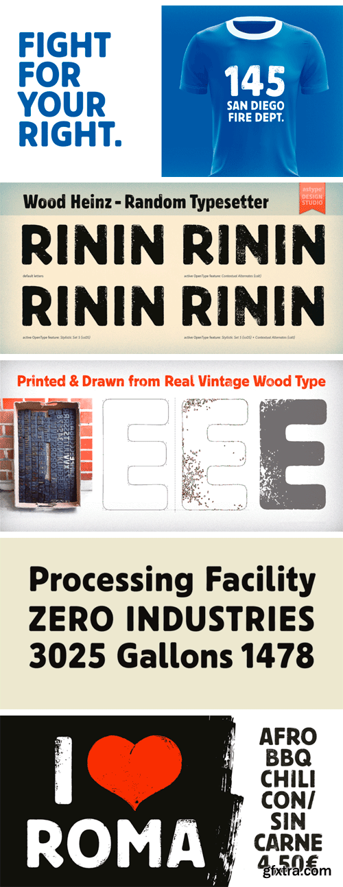
https://www.myfonts.com/fonts/astype/wood-heinz-no4/
Just Wood Heinz No.4 - the cool display font. Wood Heinz No.4 offering up to four "printed look" variations of all the Latin base letters and figures. An OpenType letter rotator is programmed into the fonts to emulate the randomness of wood type printing. Please ensure the OpenType feature Contextual Alternates (calt) is turned on by default in your text setting application.
https://www.myfonts.com/fonts/emtype/approach/
Approach is a modern approximation to the early grotesques. An utilitarian low contrast font, a bit mechanic but plenty of character. One of its characteristic elements is a kind of ‘elbow pipe’ shape that is present in many letters like the tail of the a, f, j, t, R, Q or 1 among others. Besides, the synthetic punctuation and quotes give it a more contemporary appearance. Approach tries to feel fresh against all odds, being familiar but different.
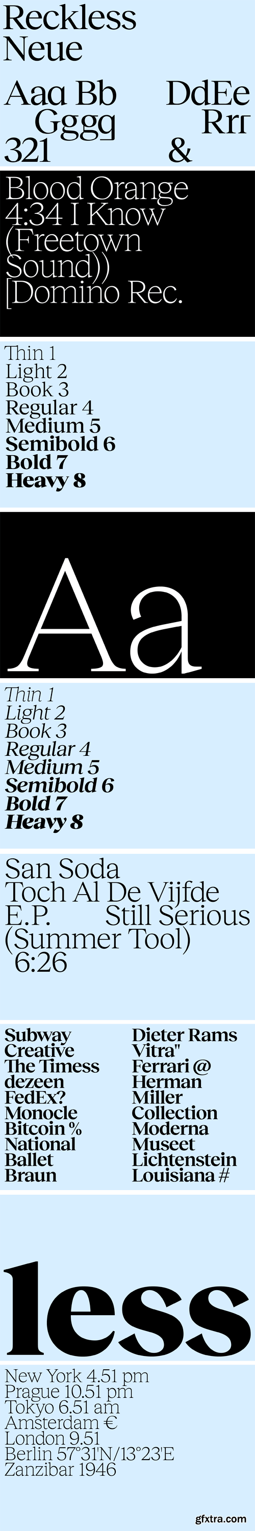
Reckless Neue Font Family
Reckless is a serif text font family with a renaissance (old-style) look and with a significantly elevated x-height. It was designed during an internship at the London University of Arts where I could study sources of serif renaissance fonts in both the UAL Saint Martins Library and the Monotype Library. The typeface includes numerous alternates.
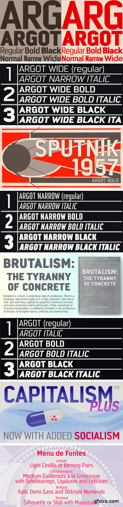
https://www.myfonts.com/fonts/k-type/argot/
Argot is inspired by condensed grotesque letterforms and would be a monolinear sans except for an unorthodox disparity between inner and outer shapes. Elegantly curved outlines contrast starkly with austere rectangular counters, suggesting a no-frills functionality, 20th century modernism, or an unsettling discordance. The squared off inner spaces also add clarity and crispness.
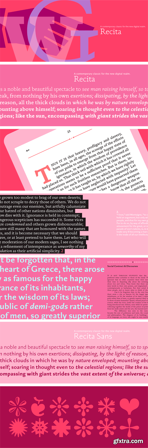
Recita & Recita Sans Family
Recita is a contemporary take on several sorts of classic typefaces, with a special focus on oldstyle fonts. With diagonal stress, chunky asymmetrical slab serifs and sturdier low contrast shapes, Recita was designed for elegant digital books and web typography. Available with and without serifs, Recita and Recita Sans were conceived for digital applications, but can easily be used on print, due to the rich texture it provide for text setting. Both serif and sans italics follow the calligraphic humanist tradition. All styles are available with matching Small Capitals and a Stylistic Set for all the basic letters that includes a set of symbols and icons for navigation, borders and textures.
SermonBox - Seasonal Collection
SermonBox - The Series Pack Collection
Top Rated News


Would you like to be a Author?