8 JPG | 3600x3600 PX | 81,5 MB


1.04GB | Duration: 3h 45m | Video: AVC (.mp4) 1280x720 15fps | Audio: AAC 48KHz 2ch
Genre: eLearning | Level: Intermediate | Language: English
Using the powerful toolset in Adobe InDesign CC, you can create a variety of interactive documents: PDFs, ebooks, magazines, forms, and more. In this course, publishing expert Mike Rankin offers a foundation for designing engaging interactive documents and explores what's possible with each kind of document, so that you'll know which type suits the needs of your projects.
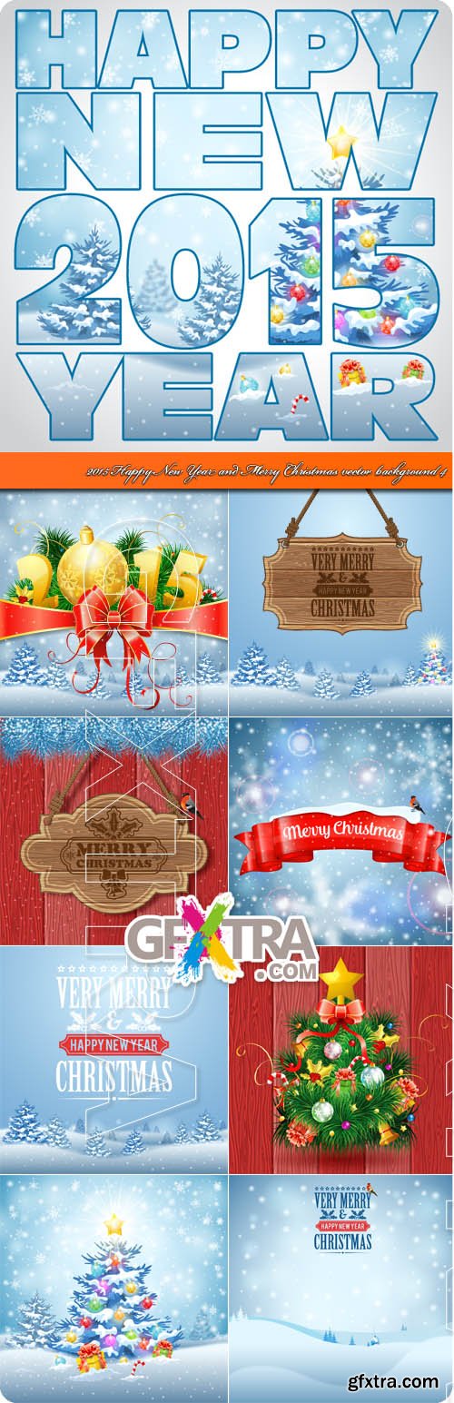
2015 Happy New Year and Merry Christmas vector background 4
EPS | 12 files | 108.04 Mb

2015 Merry Christmas card realistic ball vector 2
EPS | 10 files | 106.04 Mb


English | .MP4, x264, 720x406 | English, AAC, 2 Ch | 1 hour 2 mins | 114 MB
Instructor: Scott Kelby | Level: Beginner


.MP4, x264, 720x406 | English, AAC, 2 Ch | 1 hour 4 mins | 123 MB
Instructor: Scott Kelby | Level: Beginner


![Sketch 3.0.2 [MAS + iCloud] MacOSX](https://www.gfxtra31.com/uploads/posts/2014-05/1400223332_screen800x500.jpg)
Sketch 3.2.1 MacOSX | 24 MB
Sketch: graphic design for a digital world. Powerful tools and an elegant interface, in a single award-winning package. Because making beautiful things should be a joy, not a burden.


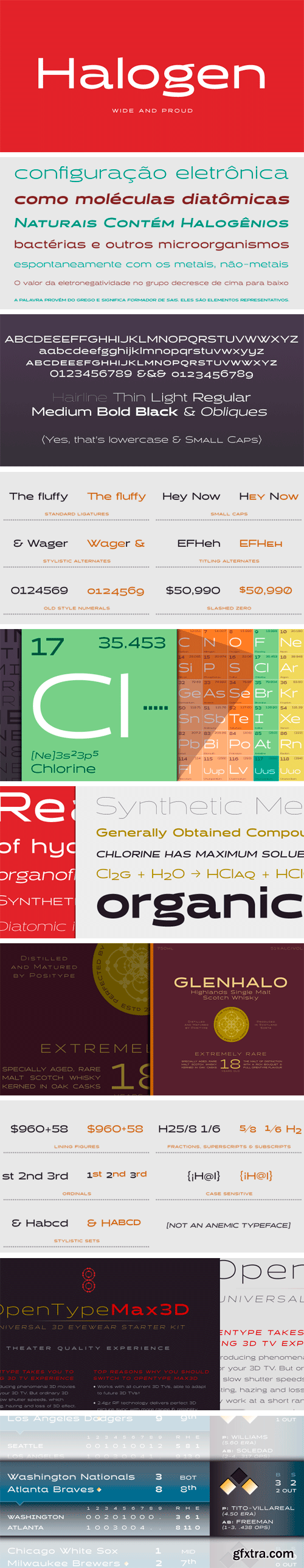
Who doesn't want or need an expansive contemporary extended sans that has a sense of style and swagger… what if it had a lowercase, small caps and various numeral options… how could you say no? This was the foundational argument I made for myself when I drew the initial alphabet on my birthday last year (something I do each year, draw a new font, kind of a fun OCD thing). I wanted to see a wide, utilitarian sans that had more to it than just a basic character set and didn't resemble standard geometric models. As I continued sketching, the letterforms were being influenced more by my ‘lettering tendencies’ than the normal mechanical trappings of drawing flat, wide letters. The letters have retained aspects of letters created by hand — stresses, modulation, naturally ending terminals. Truncation and quick clipping of strokes became antithetical to the letterforms I drew, so I continued this once I brought the design into the computer. I kept it precise and dependable, but made every attempt to keep a conscientiously crafted typeface and not let it devolve into a grid-based drone. As such, it works just as well looking back in time as much as it does assuming a lead role in a sci-fi movie.
OTF | 14 Fonts | JPG Preview | 3.7 Mb RAR

Ayumi Pro Font Family $119.20 | 8 x TTF and OTF
http://www.myfonts.com/fonts/positype/ayumi-pro/
Ayumi is one of those precocious sans. At first glance, I wanted it to look simple...basic characters, moderate modulation, common structure...but at closer inspection, it is filled with all kinds of fun and expressive details. The italics are...well, fun. They're curvy and expressive and truly compliments the face. The new Pro version includes a tightened character set, Central European glyphs, and remastered kerning.
SermonBox - Seasonal Collection

SermonBox - The Series Pack Collection

Top Rated News


Would you like to be a Author?