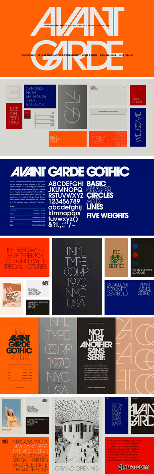
https://www.myfonts.com/collections/avant-garde-gothic-font-itc
ITC Avant Garde Gothic is a font family based on the logo font used in the Avant Garde magazine. Herb Lubalin devised the logo concept and its companion headline typeface, then he and Tom Carnase, a partner in Lubalin’s design firm, worked together to transform the idea into a full-fledged typeface. The condensed fonts were drawn by Ed Benguiat in 1974, and the obliques were designed by André Gürtler, Erich Gschwind and Christian Mengelt in 1977. The original designs include one version for setting headlines and one for text copy. However, in the initial digitization, only the text design was chosen, and the ligatures and alternate characters were not included. The font family consists of 5 weights (4 for condensed), with complementary obliques for widest width fonts. When ITC released the OpenType version of the font, the original 33 alternate characters and ligatures, plus extra characters were included.

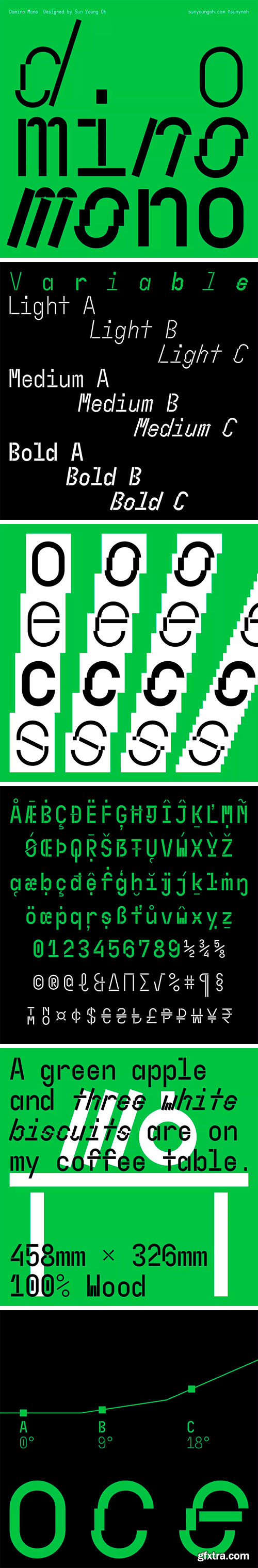
https://type-department.com/collections/sans-serif-fonts/products/domino-mono/
Domino Mono is an experimental monospaced variable typeface allowing its user to play with both the weight and angle axis to get the look they desire. Inspired by the movement of toppling dominoes, the oblique letter shapes of Domino Mono are designed by tilting or dismantling the fragments of letters instead of shearing or reforming themselves, maintaining the same letter width throughout the entire font family thus bolder style has a dense and heavy impression. The variable weight is applied only to letters and numbers to retain the legibility of complex symbols as well as to give a rhythm in a long paragraph mixed with multiple punctuations and symbols.


SermonBox - Seasonal Collection

SermonBox - The Series Pack Collection
Top Rated News


Would you like to be a Author?